
Learn how do you normalize data in excel with practical steps and real-world examples to boost your data analysis.
So, how do you normalize data in Excel? It's all about using a few clever formulas to bring your numbers into a common range, usually between 0 and 1. Think of it as translating different languages into one universal dialect.
The two heavy hitters here are Min-Max scaling, using the formula =(value - min) / (max - min), and Z-score standardization, which is even easier with Excel's built-in STANDARDIZE function.
Why Normalizing Data in Excel Is Your Secret Weapon
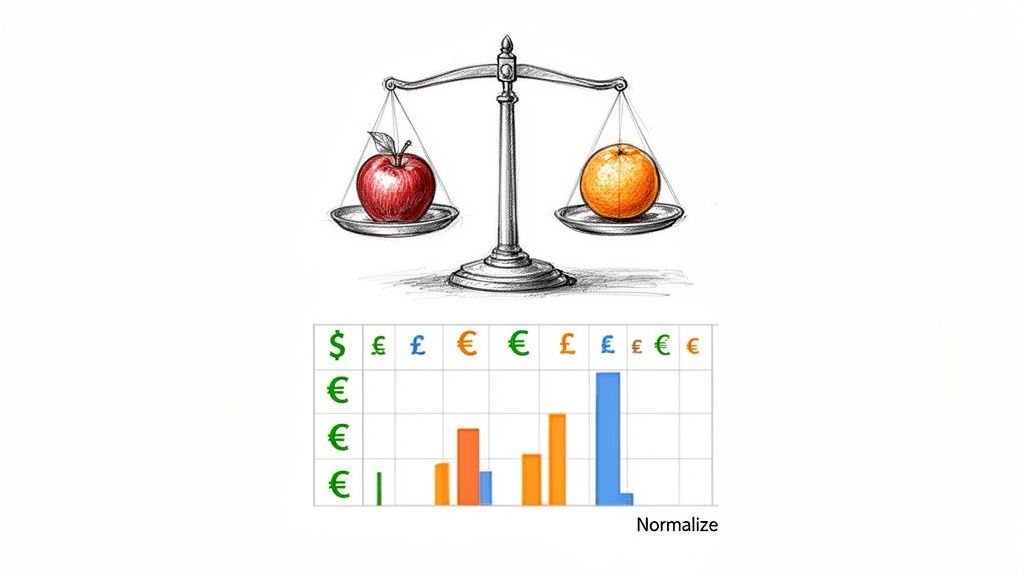
Ever tried comparing apples to oranges? That’s exactly what it feels like when you're staring at a spreadsheet full of raw, messy data.
Let's say you've just pulled a bunch of data from the web—maybe you followed a guide on scraping website data into Excel to gather competitor prices from different countries. Now you’ve got costs in USD, EUR, and GBP. They all have different scales and magnitudes. How on earth do you spot the real best deal?
This is where normalization swoops in to save the day. It's a simple but incredibly powerful technique for rescaling numbers so you can finally make fair, direct comparisons. No more flawed strategies based on skewed data. You're about to turn that chaotic spreadsheet into a goldmine of clean, comparable, and analysis-ready insights.
Unlock Your Data's True Potential
When your variables are on wildly different scales, your analysis can get completely thrown off. Imagine a column with massive numbers, like revenue in the millions, sitting next to a column of customer ratings from 1 to 5. The revenue figures will naturally dominate any calculation, drowning out the equally important rating data. Normalization levels the playing field.
It’s an absolutely essential first step for so many data tasks:
Accurate Comparisons: Finally, you can fairly evaluate things like sales performance across different regions or the effectiveness of marketing campaigns that had wildly different budgets.
Better Machine Learning: Many algorithms, from clustering to regression, just work better when the input features are on a similar scale. This leads to faster training and more accurate models.
Clearer Visualizations: Create charts and graphs that aren't distorted by one massive outlier. This gives you a much more honest picture of what your data is actually telling you.
By standardizing your data, you're cutting out the noise and making sure every piece of information gets an equal say in your analysis. It's the difference between flying blind and making data-driven decisions with total confidence.
Honestly, getting a grip on normalization is a core skill for anyone serious about data. If you're looking to level up, it's always a great idea to enhance your team's Microsoft Excel proficiency and build that solid foundation.
Excel Normalization Methods at a Glance
To help you choose the right tool for the job, here's a quick rundown of the most common normalization techniques you'll be using in Excel.
Method | Best For | Key Excel Function/Formula | Scale |
|---|---|---|---|
Min-Max Scaling | When you need a strict 0 to 1 range, perfect for algorithms that require bounded inputs. |
| Bounded [0, 1] |
Z-Score (Standardization) | General-purpose use, especially when you need to handle outliers and understand how far a data point is from the mean. |
| Unbounded, centered at 0 |
Decimal Scaling | A quick-and-dirty method for when you just need to move the decimal point to get values between -1 and 1. |
| Bounded [-1, 1] |
Log Transformation | Taming highly skewed data, like income or population figures, to make patterns more visible. |
| Varies, reduces skew |
Each method has its place, and knowing which one to pick is half the battle. Min-Max is fantastic for its simplicity and clear boundaries, while Z-score is a powerhouse for statistical analysis.
Making Clear Comparisons with Min-Max Scaling
Min-Max scaling is one of the easiest and most popular ways to put everything on a level playing field. It's a brilliantly simple method that rescales your data into a clean 0 to 1 range, which is perfect for comparing metrics measured on wildly different scales.
Say you've scraped e-commerce data and you're looking at customer reviews on a 1-5 star scale right next to customer satisfaction scores that go from 1 to 100. If you just throw that into an analysis, the satisfaction scores will completely dominate the product ratings. Min-Max scaling fixes this problem instantly.
Applying the Min-Max Formula in Excel
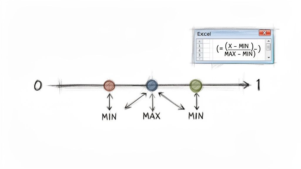
The formula behind this technique is beautifully straightforward, which is why it's so powerful in Excel. For any data point you're looking at (let's call it X), you find its normalized value with this equation:
Normalized Value = (X - MIN) / (MAX - MIN)
Let's quickly unpack that:
X: The specific number you're trying to normalize.
MIN: The absolute smallest value in that entire column of data.
MAX: The absolute largest value in that same column.
By subtracting the minimum from your data point and then dividing by the total range (MAX minus MIN), you're essentially mapping every value to a proportional spot between 0 and 1. The original minimum value becomes 0, the maximum becomes 1, and everything else falls neatly in between.
A Practical E-commerce Example
Imagine you're a D2C brand using an AI scraper like Clura to monitor competitor prices across Amazon and Shopify. Your spreadsheet is probably a chaotic mix of currencies and price points. For instance, you might see US listings hitting $299 while UK listings are at £249 (about $320). That 25% price variance can totally throw off your competitive analysis. In fact, non-normalized data is a huge source of mispricing errors for sellers, a point you can see explored further in this article on how data normalization helps businesses on aampe.com.
Here’s how you can fix this in seconds.
Find the Min and Max: First, find the absolute minimum and maximum prices in your entire list. Put these into separate cells for easy reference. Let’s say you put your lowest price in cell D2 (
=MIN(B:B)) and your highest in E2 (=MAX(B:B)).Enter the Formula: Now, in a new column (let's use column C), click into cell C2 and type this formula:
=(B2-$D$2)/($E$2-$D$2)Apply to All Rows: See those dollar signs (
$)? They create absolute cell references, which lock the MIN and MAX cells in place. Grab the small square at the bottom-right corner of cell C2 and drag it all the way down your column.
Boom! In a couple of clicks, you've just normalized thousands of rows. Every single price is now on a consistent 0-to-1 scale, making your comparisons accurate and your insights far more reliable.
This technique is a non-negotiable step when preparing data for machine learning models or any analysis where the "distance" between data points is a critical factor. It ensures no single feature with a large scale can unfairly skew your results, giving you a much clearer picture of what your data is really telling you.
Z-Score Standardization: Unlocking the Story Behind Your Data
While Min-Max scaling is fantastic for corralling your data into a neat 0-to-1 box, sometimes you need more than just a new scale. You need context. This is where Z-score standardization really shines. It's the powerhouse method for understanding exactly how any single data point compares to the entire group.
Instead of just squishing values into a range, the Z-score technique re-centers your data around a mean (average) of zero. Each number is then transformed to show how many standard deviations it sits away from that new center. It's an incredibly powerful way to spot outliers and truly grasp the distribution of your data.
How Z-Score Works
The formula itself is pretty straightforward: you take a data point, subtract the dataset's average, and then divide the result by the standard deviation. A positive Z-score? That value is above average. Negative? It's below. A Z-score of 2, for instance, tells you that data point is two standard deviations higher than the average—which is often a pretty big deal!
This method is the go-to for serious statistical analysis, where the relative position of a value is what truly matters.
A Real-World Sales Scenario
Picture this: you're a sales manager at a growing company like Clura, and you're analyzing lead data pulled from LinkedIn and Crunchbase. Your US sales team averages $150,000 per rep, but your European team averages €120,000. Trying to compare performance is a classic apples-to-oranges mess, and it can seriously mess up your outreach strategies.
This is a huge time-waster for so many teams. In fact, some surveys show 68% of sales teams burn over 20 hours a month just manually scaling data. Thankfully, you can read more about how Excel's STANDARDIZE function boosts efficiency on savantlabs.io.
Excel’s built-in =STANDARDIZE function makes this whole process a breeze. The syntax is simple: =STANDARDIZE(x, mean, standard_dev)
x: The cell you want to transform (e.g.,
B2).mean: The average of the entire dataset.
standard_dev: The standard deviation of that dataset.
Putting STANDARDIZE to Work in Excel
First things first, you need to calculate the mean and standard deviation for the entire column of data you're working with. Excel makes this easy with the =AVERAGE(range) and =STDEV.P(range) functions.
Pro Tip: Manually calculating these two values first really helps you get a feel for your data. Since the Z-score is built entirely on the mean and standard deviation, using a dedicated online Mean Calculator can be a great way to double-check your numbers on more complex datasets.
Let's assume your sales figures are sitting in column B.
Calculate the Mean: In an empty cell (say, E1), pop in this formula to get the mean:
=AVERAGE(B2:B100)Calculate Standard Deviation: In another cell (E2), do the same for the standard deviation:
=STDEV.P(B2:B100)Standardize Your Data: In a new column (let's call it "Standardized Sales" in column C), click into cell C2 and type this formula:
=STANDARDIZE(B2, $E$1, $E$2)
See those dollar signs ($)? They create an absolute reference, which locks onto your mean and standard deviation cells. This is crucial! Now, just grab the fill handle and drag the formula down.
Boom! Your entire dataset is standardized. A US sale of $180,000 and a European sale of €145,000 can now be compared on a level playing field, showing you which one was truly the stronger performance relative to its team's average.
Let Power Query Do the Heavy Lifting for You
Tired of manually applying formulas, especially when your datasets are constantly changing? It’s time you got acquainted with Power Query, Excel’s built-in data transformation powerhouse. This tool lets you create an automated normalization workflow that you can set up once and run forever, all without touching a single formula on your worksheet.
Think about it. Maybe you're tracking daily sales figures or pulling fresh competitor pricing every morning. Normalizing that new data by hand is not just a tedious chore; it's practically an invitation for errors. Power Query takes that entire repetitive task off your plate.
Your First Steps Into the Power Query Editor
First, you need to get your data into the Power Query Editor. This is where all the transformation magic happens. Think of it as a separate workshop where you can mold, shape, and clean your data to perfection without ever touching the original source file.
Getting there is easy. Just select your data range or table, head over to the Data tab on the ribbon, and click From Table/Range. Presto! The Power Query Editor window will pop up with your data loaded and ready to go. You'll immediately notice the interface is incredibly user-friendly—it’s all point-and-click, no complex formulas required.
Building an Automated Normalization Machine
With your data loaded in the editor, you can start building out your normalization logic. Let’s stick with our Z-score standardization example. The goal is to calculate the average and standard deviation of a column and then use those values to transform each data point.
Here's how to approach this inside the editor:
Calculate Key Stats: Go to the Transform tab and look for the Statistics button. From there, you can calculate the Average and Standard Deviation for the column you're working on. Power Query calculates these for you, and you can easily reference them.
Create a Normalized Column: Now, go to the Add Column tab and choose Custom Column. A dialog box will appear, letting you write a simple formula. For a Z-score, it'll look something like this:
([YourColumnName] - AverageValue) / StandardDeviationValue. You just plug in the names and numbers.Load It Back to Excel: Once your new normalized column is ready, just click Close & Load. Power Query will send the transformed data back into a new sheet in your workbook.
Every single action you take—from calculating the mean to adding that custom column—is recorded in the "Applied Steps" pane on the right. This creates a reusable recipe for your data.
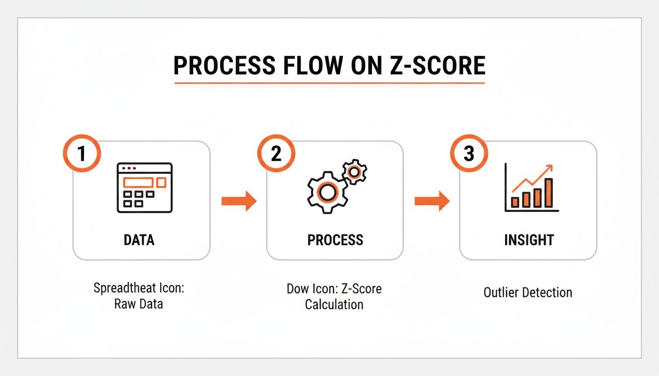
This visual flow shows the core logic behind transforming raw data into a standardized format ready for deeper analysis.
The real beauty of this system is its "set it and forget it" nature. The next time you get new data, you don't have to repeat a single step. You just go to the Data tab and hit Refresh All. Boom. Power Query instantly reruns your entire normalization sequence on the updated dataset, saving you a massive amount of time and ensuring flawless consistency.
This is a must-have skill for any team that needs to automate data extraction and wants a seamless, reliable way to get it ready for analysis.
More Than Just Numbers: Advanced Tips for Tricky Data
So far, we've focused on numbers. But what happens when the data you've scraped is a chaotic mix of text? Raw data is almost never clean, and normalization techniques are just as crucial for text as they are for numbers.
Picture this: you've pulled a list of company locations, and the 'Country' column is a mess. You've got 'USA', 'U.S.A.', and 'United States' all floating around. To your computer, those are three entirely separate places. This formatting chaos is a common headache, especially when you're pulling information from documents. Before any meaningful analysis can happen, you've got to standardize that text. If you're wrestling with data from documents, our guide on PDF data extraction to Excel has some fantastic tips to get you started.
Taming Wild Text with XLOOKUP
A great tool for this cleanup is XLOOKUP. It's an incredibly elegant solution. All you need to do is create a simple "lookup table" on another sheet. This table acts as your rulebook, mapping all the messy variations to one clean, standard term.
Your lookup table might look something like this:
Messy Text | Standard Text |
|---|---|
USA | United States |
U.S.A. | United States |
United State | United States |
UK | United Kingdom |
U.K. | United Kingdom |
Then, you just pop an XLOOKUP formula into your main dataset. It'll scan your messy column, find the matching term in your lookup table, and pull in the correct, standardized version. It’s a lifesaver for enforcing consistency across thousands of rows without manually editing a thing.
Dealing with Skewed Data Using Log Transformation
Now, let's swing back to numerical data. What do you do when your numbers are completely skewed? I'm talking about datasets like website traffic, social media followers, or income levels, where a handful of massive outliers can throw off your entire analysis.
This is where a Logarithmic Transformation comes in. It's a brilliant trick. By applying Excel's =LOG() or =LOG10() function, you effectively compress the scale of the larger numbers. This reels in those extreme outliers, making the underlying patterns in your data much clearer. It’s an essential technique for taming skewed data so your charts and models actually show what's going on.
The key takeaway here is that normalization isn't one-size-fits-all. The right method—whether it’s XLOOKUP for text or a Log Transformation for skewed numbers—comes from really understanding your data's personality and what you’re trying to accomplish.
This is especially true when you're pulling data from all over the place. Imagine you’re a market analyst using a tool like Clura to grab company profiles. You might find US salaries averaging $110k and Indian salaries around ₹25 lakhs (roughly $30k). If you feed that raw data into a model, the huge difference in scale could skew your results by up to 40%. Z-Score standardization (a feature in Excel since 2010) is perfect for this, as it resets all values to have a mean of 0, putting everything on a level playing field. You can dive deeper into the various methods for normalizing data in Excel on geeksforgeeks.org.
Got Questions About Normalizing Data? We've Got Answers.
Jumping into data normalization for the first time? It's totally normal to have a few questions pop up. Let's walk through some of the most common ones so you can feel confident you're on the right path.
What's the Real Difference Between Normalization and Standardization?
This is a big one! It's super common for people to mix these two up, but they're actually quite different.
Normalization is all about squeezing your data into a specific, fixed range. The most common one is 0 to 1, which is exactly what Min-Max scaling does. I find this method is a lifesaver when my data's distribution isn't a neat bell curve and I just need everything to play nicely within set boundaries.
Standardization, on the other hand, is about transforming your data to have a mean of 0 and a standard deviation of 1. This is the magic behind the Z-score method. It's the industry standard for a ton of statistical models (like logistic regression) that work best when the data is centered around zero.
When Do I Pick Min-Max Scaling Over Z-Score?
Great question. The right choice really hinges on what you're trying to accomplish with your data.
Go for Min-Max scaling when you need your values tucked neatly into a specific range, making them easy to compare and interpret. It's straightforward and perfect for algorithms that expect inputs to be within a certain bound. Just a heads-up: it's pretty sensitive to outliers. One crazy-high or low value can squish all your other data points into a tiny little corner of the range.
Use Z-score standardization when you're more interested in how a data point stacks up against the average. It's also fantastic for sniffing out outliers. Because it doesn't have a hard cap, it handles extreme values much more gracefully, which makes it a much safer bet for most serious statistical work.
Can I Normalize Text or Date Data in Excel?
Absolutely! You just can't use the same mathematical tricks like Min-Max or Z-score. For non-numeric data, "normalizing" is all about cleaning and standardizing.
With text, this means getting all your categories to be consistent. Think about turning "NY," "N.Y.," and "New York" all into one clean, standard value. For dates, you might convert them into something numerical, like the number of days that have passed since a specific start date.
Power Query is a game-changer for this stuff. It lets you set up powerful, reusable rules to clean up text and dates automatically. It's saved me from countless hours of tedious manual work.
What Are the Common Pitfalls to Avoid?
I've seen a few classic mistakes trip people up over the years. Here are the big ones to watch out for.
A huge one, especially in machine learning, is normalizing your training and testing datasets separately. You always want to calculate the scaling parameters (like the Min, Max, or Mean) from your training data and then apply those same parameters to your test data. This prevents a nasty little problem called data leakage.
Another easy mistake is normalizing when you don't even need to. Some models, like decision trees, couldn't care less about the scale of your data, so you'd just be wasting your time. Finally, forgetting to deal with extreme outliers before you use Min-Max scaling can really skew your results, mashing most of your data into a uselessly small part of that 0-1 range.
Ready to stop wrestling with messy data and start automating your workflows? Clura is a browser-based AI agent that helps teams scrape, organize, and export clean data from any website in just one click. Explore prebuilt templates today and see how easy it is to get analysis-ready data.
