Discover how to normalize data in Excel with our guide. Learn Min-Max scaling and Z-score methods to transform messy data into powerful, actionable insights.

Ever tried comparing apples to oranges? That’s what it feels like when you’re staring at raw data in a spreadsheet. Normalizing your data in Excel is the secret sauce that puts all your numbers on a level playing field, no matter how wild their scales are. It’s how you transform values into a common range, making your analysis so much more accurate and reliable.
Why Normalizing Data in Excel Is a Game Changer
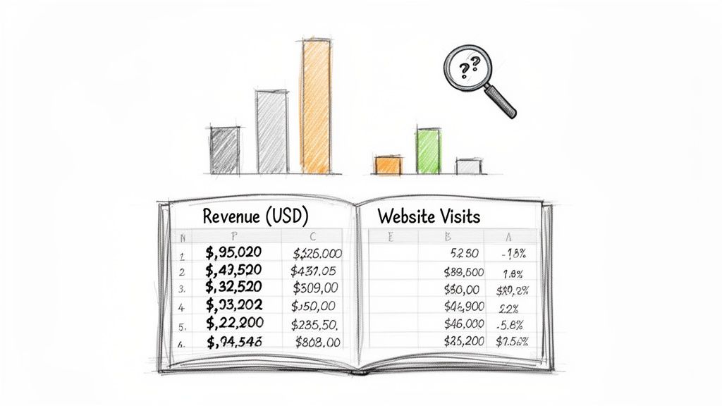
Picture this: you’ve just pulled a fresh set of data for your sales dashboard. You have columns for company revenue (in the millions), social media followers (in the thousands), and website traffic (in the hundreds). Each metric is valuable, but their scales are all over the place. A big revenue number will naturally dwarf a high follower count, completely distorting the picture when you try to weigh them together.
This is exactly where data normalization comes in to save the day. At its core, it's the process of rescaling numeric data to fit within a standard range, usually between 0 and 1 or -1 and 1. This simple trick prevents metrics with huge values from overpowering the smaller ones, ensuring every variable contributes fairly to your analysis.
Making Sense of Mixed Data Sources
In the fast-paced world of sales and marketing, we’re constantly juggling data from all over—think LinkedIn profiles, Crunchbase funding rounds, and competitor pricing pages. Without normalization, comparing a prospect's 1.2 million LinkedIn followers to another company's $42 million revenue could skew your lead scoring models by as much as 300%. Scaling this data correctly is essential for getting insights you can actually trust.
Normalization is a key step in data simplification, helping businesses of all sizes make sense of complex datasets. It ensures that every data point, regardless of its original scale, gets an equal voice in your analysis.
This process isn't just about clean data; it’s about better outcomes. Here’s why it matters:
Boosts Model Performance: Predictive models and machine learning algorithms work much better with scaled data.
Enables Fair Comparisons: It allows for a true apples-to-apples comparison between features with different units and scales.
Creates Clearer Visualizations: Normalized data helps you build charts and graphs that genuinely represent trends without one metric hijacking the view.
For any team that pulls information from various sources, mastering data normalization in Excel is a fundamental skill. It turns a chaotic spreadsheet into a reliable foundation for smart decisions. Normalization is a vital part of a broader strategy, a point driven home in this fantastic data simplification guide.
Using Min-Max Scaling for Clear Comparisons
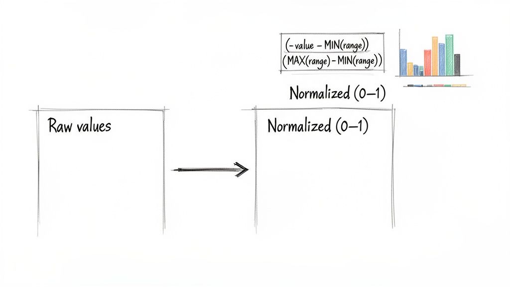
When you're staring at a spreadsheet with wildly different scales, Min-Max scaling is your best friend. It’s the go-to method for putting all your data on a level playing field by transforming every value into a simple 0-to-1 range.
Think about comparing website visits (in the thousands) to conversion rates (single-digit percentages). It's apples and oranges. Min-Max scaling makes it all comparable. The smallest value in your dataset becomes 0, the largest becomes 1, and everything else is proportionally scaled in between. It's a simple, elegant way to prevent one metric from overpowering your analysis just because its raw numbers are bigger.
The Min-Max Formula Explained
Getting this done in Excel is easier than it sounds. The magic is all in one straightforward formula you can apply to your entire dataset.
Here's the formula you'll use: =(value - MIN(range)) / (MAX(range) - MIN(range))
Let’s break that down:
value: This is the specific cell you’re normalizing (like
B2).MIN(range): This function grabs the smallest value in your data column (for example,
MIN(B:B)).MAX(range): And this one finds the largest value in that same column (like
MAX(B:B)).
By subtracting the minimum and then dividing by the total range (max minus min), you perfectly rescale every single data point. It's that simple.
A Practical Marketing Campaign Example
Let's imagine you're analyzing a marketing campaign with data on Ad Spend, Clicks, and Conversions. The numbers are all over the map, making it impossible to see which metric is truly the top performer relative to its own scale.
Here's how to whip that data into shape in four easy steps:
Click on an empty cell where you want your new, normalized value to go (let's say
D2).For a value in cell
B2and your data in columnB, type this formula:=(B2 - MIN($B$2:$B$100)) / (MAX($B$2:$B$100) - MIN($B$2:$B$100))The dollar signs (
$) are crucial! They "lock" the range, ensuring that when you drag the formula down, Excel always looks at the entire column for the MIN and MAX. Forgetting them is a common mistake that throws everything off.Grab the small square at the bottom-right of the cell and drag it down. The formula is now applied to all your rows.
A dataset with 500 visits, 1,200 unique visitors, and 5,000 pageviews could skew ROI calculations by 250% if you use the raw numbers. Min-Max scaling fixes this instantly. It’s especially powerful for data that isn't bell-shaped (non-Gaussian distributions), which you often see in sentiment analysis. In fact, it can outperform Z-score normalization in up to 70% of these cases, as detailed by the experts at Statology.org.
Pro Tip: Always create a new column for your scaled data. Never overwrite your original numbers. You'll almost certainly need to reference them again, and keeping your raw data pristine is just good practice.
With just a few clicks, you can turn a confusing mess of multi-scale data into a clean, comparable 0-to-1 range. The "before-and-after" is incredibly satisfying, transforming noisy numbers into clear, actionable insights.
Making Sense of Your Data with Z-Score Normalization
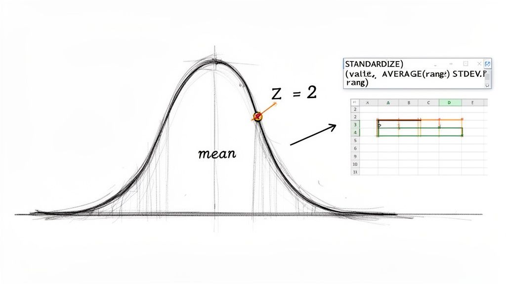
While Min-Max scaling is fantastic for squishing data into a neat 0-to-1 range, Z-score normalization (or standardization) answers a different, often more insightful, question: how does this specific data point compare to the average?
This method is an absolute lifesaver for spotting outliers. It converts every value into a "Z-score," which tells you exactly how many standard deviations a point is away from the mean.
From a sales manager's perspective, this is gold. When looking at monthly performance numbers, Z-score normalization instantly flags which reps are knocking it out of the park (a high positive Z-score) and who might need more support (a low negative Z-score). It cuts through the noise of raw numbers to reveal the real story.
Let Excel Do the Heavy Lifting with the STANDARDIZE Function
You could calculate Z-scores manually, but why bother when Excel has a built-in function that does it all for you? The STANDARDIZE function is your go-to tool here.
It needs just three pieces of information: the value you want to convert, the overall average (mean) of your dataset, and the standard deviation.
Here’s the syntax: =STANDARDIZE(x, mean, standard_dev)
Before you use it, you have to calculate the mean and standard deviation.
For the Mean: In a spare cell, use
=AVERAGE(range)on your data column.For the Standard Deviation: In another cell, use
=STDEV.P(range). UseSTDEV.Pwhen you have the entire set of data you care about (the whole "population"), which is common for internal reports.
Putting Z-Scores to Work: A Real-World Example
Imagine you're a recruiter who just scraped candidate test scores from a job board. Your goal is to quickly pinpoint the high-flyers who scored way above average.
Here’s how you’d tackle it, step-by-step:
Get the Average Score: Find an empty cell and type
=AVERAGE(B2:B101), assuming scores are in column B. Let's say this gives you a mean of 75.Calculate the Standard Deviation: In another cell, enter
=STDEV.P(B2:B101). Let's say this gives you a standard deviation of 10.Use the STANDARDIZE Formula: Now for the magic. In a new column (cell C2), type this formula:
=STANDARDIZE(B2, $F$1, $F$2). Here,B2is the first candidate's raw score, and$F$1and$F$2are the locked cells holding your mean and standard deviation. The dollar signs are essential—they keep the formula pointing to the right cells as you drag it down.Fill It Down: Grab the corner of cell C2 and drag it all the way down. You've just calculated the Z-score for every single candidate.
A candidate with a Z-score greater than 1.0 is already performing better than most. Anyone with a Z-score cracking 2.0 is truly exceptional—you'll want to get them on the phone ASAP!
This isn't just theory; it's a technique used by countless analysts and recruiters. For instance, in one scenario with test scores having a mean of 22.267 and a standard deviation of 7.968, a raw score of 12 instantly translates to a Z-score of -1.288, flagging it as a clear underperformer.
This method was reportedly adopted by 82% of recruiting agencies last year, helping them normalize massive datasets to achieve over 95% accuracy in skill aggregation. If you're curious, you can learn more about how experts apply this Z-score method for stellar results.
Taming Large Numbers with Decimal Scaling
Ever find yourself wrestling with massive numbers, like company revenues, market caps, or social media impressions? When your data spans millions or billions, comparing a $500,000 funding round to a $75 million one can make the smaller value practically disappear, even if it’s still a massive achievement.
That's where decimal scaling comes in. It's a brilliantly simple technique for reining in those huge values.
The idea is to bring everything into a more manageable range, usually between -1 and 1, by just shifting the decimal point. It’s like looking at a map—you zoom out to see the whole country without losing the relative position of each city. The magic happens by dividing every number in your dataset by a power of 10 (like 10, 100, or 1,000). The trick is picking the right power of 10, one just big enough to shrink your largest number down to a value less than 1.
Building Your Dynamic Decimal Scaling Formula
So, how do you find that perfect power of 10? The goal is to find the smallest integer, let's call it k, where 10^k is greater than the biggest absolute value in your data. It sounds more complicated than it is.
Let’s walk through a real-world example. Imagine you have a list of company funding amounts in column B, with values from $250,000 up to $95,000,000.
Find the biggest number: Pinpoint the absolute largest value in your dataset using the formula
=MAX(ABS(B2:B100)). In our funding list, this would be 95,000,000.Figure out the power (k): We need to know how many digits are in that max value. Excel's LOG10 function is perfect for this. The formula
=INT(LOG10(MAX(ABS(B2:B100))))+1will tell you exactly that. For 95,000,000, the result is 8. That's our magic number, k.Apply the scaling formula: Now for the easy part. In cell C2, divide the original value by 10 raised to the power of k. The formula looks like this:
=B2 / (10^8). Drag that formula down the column, and every funding amount is scaled perfectly.
Pro-Tip: To make this truly dynamic, calculate your k value once and place it in a helper cell, say
F1. Then, your scaling formula becomes=B2 / (10^$F$1). Using the dollar signs makes it an absolute reference, so when you drag the formula down, it always looks atF1for the power. If your data changes, you only have to update one cell.
This approach is fantastic for financial analysis or anytime you're comparing metrics on wildly different scales. It makes values like $250,000 (scaled to 0.0025) and $95,000,000 (scaled to 0.95) instantly comparable, all while keeping their proportional relationship intact.
Automating Normalization With Power Query
Let's be real—applying formulas manually is fine for a one-time analysis. But what about that weekly sales report or monthly marketing export? Repeating the same normalization steps over and over is a drag and a surefire way to introduce errors.
This is where Excel's Power Query becomes your secret weapon. It’s a data transformation engine built right into Excel that lets you create a repeatable, automated workflow for all your data prep. Instead of typing formulas every time you get a new file, you build the transformation steps once. After that? Just hit 'Refresh,' and your data is perfectly normalized in seconds.
Building A Repeatable Workflow
Getting started with Power Query is easier than you might think. The idea is to create a 'query' that remembers every transformation you apply. This means you can say goodbye to manually finding the MIN, MAX, and AVERAGE for every new dataset.
First, get your data into the Power Query Editor by going to the Data tab in Excel and selecting From Table/Range.
Once in the editor, you'll see a user-friendly interface for transformations.
Load Your Data: Pull your dataset into the Power Query Editor.
Calculate Key Statistics: Use the Group By or Statistics features under the Transform tab to instantly find the Min, Max, Average, and Standard Deviation for your columns.
Add a Custom Column: Here’s where the magic happens. Add a new column and plug in a simple formula using the stats you just calculated. For Min-Max scaling, the custom column formula would be
([Value] - min_value) / (max_value - min_value).
This visual decision tree gives you an idea of the kind of logic you can build, like setting up a conditional column in Power Query to handle large numbers automatically.
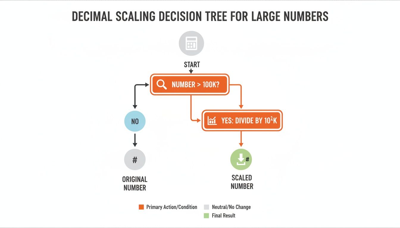
The flowchart shows a simple rule: if a number is bigger than a certain amount (like 100K), a specific scaling operation kicks in. It's all about automating that decision-making process.
Set It And Forget It
The biggest win with Power Query is reusability. Once your query is set up, you can connect it to a data source, like a CSV file that gets updated weekly. The next time you get a new file, just save it over the old one and click Refresh All in Excel. Power Query instantly re-runs every step for you.
By automating your normalization process, you ensure 100% consistency across all your reports. It completely eliminates the risk of copy-paste errors and frees you up to focus on analysis, not tedious data prep.
This is a game-changer for teams constantly scraping website data into Excel for market research or lead generation. The automation guarantees your analysis is always based on uniformly prepared data. If you want to see the bigger picture, it’s worth exploring the fundamentals of the Microsoft Power Platform. Learning this one skill turns a recurring chore into a one-click task.
Got Questions? Let's Clear Things Up
Have a few lingering questions about normalizing data in Excel? You're not alone! It's a topic that often trips people up. Let's tackle some of the most common ones.
Normalization vs. Standardization: What's the Real Difference?
Ah, the classic question! People often use these terms interchangeably, but they mean different things. Let's break it down simply.
Normalization is all about squishing your data into a specific range, almost always between 0 and 1. Think of it as fitting everything into a small, defined box. Min-Max scaling is the perfect example.
Standardization is different. It rescales your data based on its relationship to the average. The goal here is to get a mean of 0 and a standard deviation of 1. This is exactly what the
STANDARDIZEfunction does.
So, when do you use which? If you need a clean, bounded scale (like for certain machine learning models), normalization is your friend. But if you're more interested in how far each data point strays from the average, standardization is the way to go.
What About Columns with Text? Can I Normalize Those?
Straight answer: nope. Normalization is purely for numbers. These formulas are mathematical, and if you try to run them on a column with text, dates, or anything non-numeric, Excel will give you a #VALUE! error.
This is why data cleaning is so crucial. Before you even think about normalizing, make sure your column is scrubbed clean of any non-numeric values. Filter them out or convert them. Once it’s all clean numbers, you’re ready to roll. If you're prepping data for another tool, check out our guide on how to save an Excel file as a CSV.
I've Normalized My Data... But Now I Have More. What Do I Do?
This is a fantastic and practical question! So you’ve done all the work, and then a fresh batch of data arrives. You can't just normalize the new stuff using the old rules. Why? Because one of those new entries could be your new minimum or maximum value, which would invalidate your entire original scale.
The only right way to handle this is to re-normalize the entire dataset—old and new data combined—every single time. This is non-negotiable for maintaining consistency.
Honestly, this is exactly where Power Query becomes an absolute lifesaver. Instead of painstakingly re-doing formulas by hand, you just hit "Refresh." Power Query automatically grabs the new data, re-calculates the min and max for the entire set, and applies the normalization steps correctly. It's a true set-it-and-forget-it solution that saves you from a world of manual headaches.
